How to Read a Crypto Chart: Candlesticks and Patterns for Beginners
Crypto charts look intimidating at first, but the basics are learnable in an afternoon. This beginner's guide explains candlesticks, timeframes, support and resistance, and how to read price action without the jargon.
Open any crypto trading app and you are greeted by a wall of green and red bars, squiggly lines, and numbers that seem designed to confuse. For beginners, a price chart can feel like a foreign language. But here is the reassuring truth: the fundamentals of reading a crypto chart are not difficult, and once they click, you will never look at a chart the same way again. This guide walks through the basics in plain language, no finance degree required.
Before we start, an important caveat. Reading charts, often called technical analysis, is a tool for understanding price behavior, not a crystal ball. No chart pattern predicts the future with certainty. Charts describe what has happened and what might be likely, but markets are unpredictable, especially in crypto. Treat what follows as a way to understand the market better, not as a guaranteed system.
Start with the candlesticks
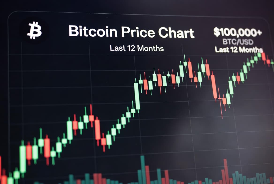
The most common type of crypto chart is a candlestick chart, and each "candle" is packed with information once you know how to read it. A single candlestick represents the price action over a specific period of time, which you choose.
Each candle has a body and usually two thin lines sticking out, called wicks or shadows. The body shows the opening and closing price for that period. The wicks show the highest and lowest prices reached during that same period.
Color tells you the direction at a glance. Typically, a green candle means the price closed higher than it opened, so buyers were in control during that period. A red candle means the price closed lower than it opened, so sellers were in control. Just by scanning the colors, you get an immediate sense of whether a market has been rising or falling.
So a single green candle tells you a small story: where price started, where it ended up higher, and the extremes it touched along the way. String many candles together and you have the full narrative of a market's movement.
Understand timeframes
One of the most important and overlooked concepts for beginners is the timeframe. Each candle represents a chosen period, and you control what that period is. On a one-hour chart, each candle covers one hour. On a daily chart, each candle covers a full day. On a weekly chart, each candle covers a week.
This matters enormously because the same market can look completely different depending on the timeframe. A coin might look like it is crashing on a five-minute chart while being in a strong uptrend on the weekly chart. Short timeframes show noise and small fluctuations. Longer timeframes show the bigger, more meaningful trends.
A common beginner mistake is staring at very short timeframes and panicking over tiny movements that mean almost nothing in the bigger picture. Zooming out to a longer timeframe often brings a sense of calm and clarity, because it filters out the noise.
Spotting trends
At the most basic level, charts help you see trends, the general direction a market is moving. An uptrend is a series of higher highs and higher lows, where each peak and each dip is generally higher than the last. A downtrend is the opposite: lower highs and lower lows, with the market stepping downward over time. And sometimes the market is just moving sideways, ranging within a band without a clear direction.
Identifying which of these three states a market is in is one of the most useful things a chart can tell you, and you can often see it just by looking, without any fancy tools. The saying "the trend is your friend" exists because going against a strong trend is generally harder and riskier than recognizing it and respecting it.
Support and resistance
Two of the most useful concepts in chart reading are support and resistance. They sound technical but the idea is intuitive.
Support is a price level where a falling market has tended to stop and bounce back up, as if there is a floor. It is a zone where buyers have repeatedly stepped in. Resistance is the opposite: a price level where a rising market has tended to stall and pull back, as if there is a ceiling. It is a zone where sellers have repeatedly appeared.
These levels are not magic lines, and they do not always hold. But they are useful because they highlight zones where the market has reacted before and might react again. When a price breaks clearly through a strong resistance level, some traders see it as a notable event. When it falls through support, the same. Watching how price behaves around these zones gives you a feel for the market's psychology.
Volume: the often-ignored clue
Most charts also show volume, usually as bars along the bottom. Volume represents how much of an asset was traded during each period. It is easy to ignore, but it adds important context.
The general idea is that volume shows conviction. A price move on high volume suggests strong participation and more significance, while a move on low volume may be weaker and less reliable. For example, a price breaking through resistance on heavy volume is generally taken more seriously than the same move on very little volume. You do not need to overanalyze it, but glancing at volume helps you judge how meaningful a move really is.
A few simple patterns
Traders talk endlessly about chart patterns, and there are dozens. As a beginner, you do not need to memorize them all. It is enough to understand that patterns are just recognizable shapes in price action that some traders believe hint at what might come next.
Some patterns suggest a trend might continue, while others suggest it might reverse. They are not guarantees, and experienced traders disagree about how reliable they are. The healthiest way to view patterns as a beginner is as one piece of context among many, not as a magic signal. Focus first on the fundamentals: candles, timeframes, trends, and support and resistance. Those will serve you far better than chasing exotic patterns.
Putting it together
When you look at a chart now, you have a simple framework. Start by zooming out to a longer timeframe to see the big picture. Identify whether the market is in an uptrend, downtrend, or ranging sideways. Notice the candles and what color has been dominating. Look for obvious support and resistance zones where price has reacted before. And glance at volume to judge how much conviction is behind the moves.
That alone puts you ahead of most beginners who stare at charts without a method. With practice, this reading becomes intuitive and fast.
The bottom line
Reading a crypto chart is a skill, and like any skill it feels overwhelming at first and natural with practice. The core building blocks are simple: candlesticks show price action, timeframes change your perspective, trends reveal direction, and support and resistance highlight important zones. Volume adds conviction to the story.
Remember that charts describe probabilities and psychology, not certainties. They are a tool to help you understand the market, used best alongside an understanding of the projects themselves and sensible risk management. Learn the basics well, practice reading real charts, and over time you will develop a genuine feel for what the market is doing.
This article is for educational purposes only and does not constitute financial advice. Technical analysis does not guarantee results. Always do your own research before making any investment.